Greeting Exiles!
It’s been a while since the last one, hasn’t it? Last we spoke, I said that we were hoping for a mid- to late-October release date for the main site. Clearly, that goal wasn’t met. That doesn’t mean that progress hasn’t been made, its just been slower than we expected. It seems that Covid and personal matters had other plans for our development team.
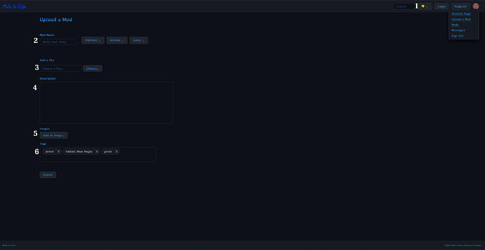
What progress do you ask? Quite a fair amount. A lot of work has went into the back end, but because of the nurture of the back end its not really anything that can be shown. However Jamie has been working hard on designing the and testing the database, constructing queries, and implementing the mod tagging system. Crow has been working on the front end, polishing the look of the site and trying to ensure the best and most inclusive experience for all of our mod authors and users, both current and future. Here’s a little preview of their work on the mod upload page.
(Note, design not final)
Let break it down:
-
This paint palette allows you change the look of the site. The theme on show is our standard dark mod. We’ve swapped out the red colouring for a “more pleasing” blue colour that is also, very handily, colourblind-friendly for most people. For those who still have colour blind issues, we’ve got other variations that are better suited for your needs, using a yellow theme.
-
This where you enter the title of your mod, select the platform it for via drop down, its version number and the game. We support more than just PC modding because some games, like Stardew Valley, support modding on Android as well.
-
This is where you place your file. Pretty simple, really.
-
The description is where you talk about your mod, you know the deal. Currently it doesn’t have rich text editing, however that it is coming. You can also upload images to your mod page here.
-
Tags are tags, and will be used to sort your mod and help it come up in searches.
With all this said we have hopes for a soft launch of the main site planned for around April. I want to stress that for as much as we’re planing on this, it may very well end up being changed.
Answering The Discourse Question:
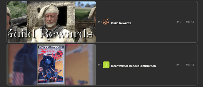
When we first put up the team site, we were fairly happy with discourse but over time that happiness has turned bitter resentment. We’ve heard feedback from users that they don’t like discourse at all. From how it looks, to how it feels to use. The team feels the same way you do, so for a very quick fix we’ve given discourse a face lift. Now when you look through mods, you’ll see that they now have an image new to their tile.
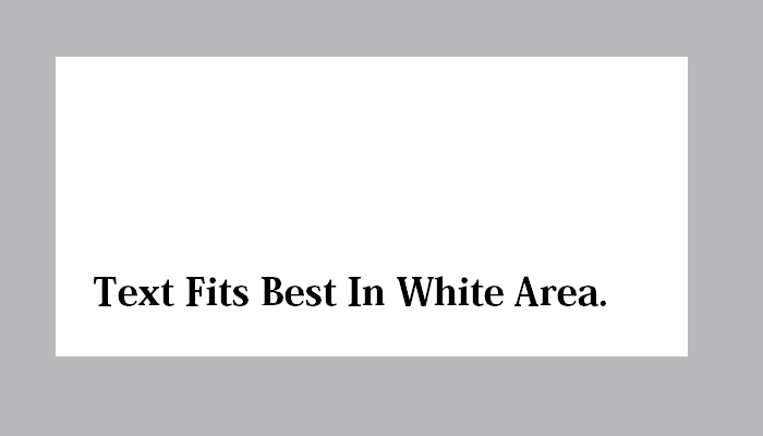
The image here is pulled from the first image in your post. If you want to have an image on your mod page, then please use this template in order for it not to get cut off. After that upload any other images in the resolution you made them in.
You may have noticed the “Featured Mod” on the front of the site. This is a little demo of the main sites “Featured Mods” and “Mod of the Day” feature. The one on discourse will pull 3 mods with the “mods” tag at random and display them on the front of the site for 24 hours before refreshing. The version on the main site will work a little differently, but hopefully you all enjoy this little teaser.
As you may know, the temp site was going to transition to our forum solution. This is no longer the case. Instead, we’re yeeting discourse completely. Currently we’re looking into nodebb and a few others as a replacement.
I want to stress that everything posted here will be transferred over to the main site, so don’t worry on that front.
About The “Notification Spam”
Lastly, I want to address the large amount of notifications from me you my have noticed. This is a side effect of the featured mod preview. This discourse version works by pulling posts with the “Mods” tag, and only with that tag. So in order for your mods to appear there, they need that tag. However, I didn’t stop there. I added tags to categorise mods on here; Weapons, Armor, Player Homes, etc.


